Wednesday

Main task

My main Double Page Spread

My Main Contents Page

My Main Front Cover Image


Music Magazines.
Kerrang, NME,Q, Mojo, Smash hits ( doesnt excist anymore), rolling atone, uncut, classic rock, top of the pops, total guitar, classic FM, mixmag.

Codes and conventions of a music magazine.

Double page spread
  • One side is a massive images or more, pictures often bleed across from one page to the other.


  • Quote to relate and link image- Hyline- name of journalist who wrote the article positioned in or by the standfirst or at the end of the article. Photographer is also credited.


  • Drop capital, as big as you want it to be.


  • Imaginative photography


  • Headlines across two pages


  • Straplines or a broder often used to bleed across double paged spread.

  • More than one image sometimes used-smaller images are used to break up the layer and make it more inviting-panals and quotes.


  • Standfirst always by headline and before start of the article- intoduces the article. Works witht he headline to tell the reader what is the article is about- also larger font.


  • Headlines-creative, eye catching.


  • Artists' name are highlighted.


  • Page Number/Title of magazine/ Issue date

E.g 2 Mogo January 2009


  • Limited use of colour, layed out in columns, usually 3 or 4.
  • Strapline- heading/tab
  • Creative use of images

  • Website address

  • Personality of journalist comes through interview, their opinion is shown.

Sunday

Planning

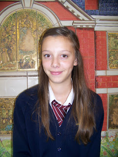
For my Preliminary task I created a school magazine, I have shown the school magazine that I created on the left.


Evaluation
My aim before the deadline was to complete my front cover and my contents page, for my magazine front cover I used the program Adobe Photoshop and then to make my contents page I used a new program to me called QuarkXpress, to make my magazine front cover I follwed the codes and conventions of a magazine, I took many pictures some of which I used on my front cover and others which I did not use, I did use some of these images on my contents page also, aswell as using some more than once.

Overal it took me two lessons to complete my front page and contents page, I produced my two peices by keeping them between the codes and conventions. Next time I will have longer to produce my work and i will take more pictures and include better articles, I will also be including a double page spread.


Photgraphs that I used


Pictures I did not use


Codes and conventions of a music magazine

Codes and conventions of magazine and contents page(s)

-Letter from the editor.
-List of bands and artists.
-Main image.
-Date on the top of contents.
-Headings to divide up contents.
-Page numbers with each topic.
-Consistant colour scheme (few colours)
-Page numbers on pictures anchor image to written contents.
-Laid out in columns (two to three columns)
-Subscription adverts.
-White backgrounds.
-Title of magazine at the top.
-Arrangement- page number
-Text- one or two words, bold/slightly larger text and subline smaller text.-


Regular and feature contents

-Appears all the time in every issue.
-Only feature once in the magazine.
-Bottom of page- page number, title, issue date, website address, contact details, picture of the editor, editor letter.

Friday

Preleminary Exercise

G321 foundation portfolio in media. (100)


Print


Preliminary exercise: front cover and contents page of a new school magazine.

Main exercise: front cover, contents page, Double page spread of a new music magazine.

100% Original.

Research and planning-evidence} BLOG

Evaluation

  • Title always in top left corner, big and bold.
  • Top statement on all music magazines.
  • Price and date either on barcode or under the title.
  • Main picture is main article in the magazine.
  • Competitions.
  • Red and black colour code.
  • A bottom line at the end of the cover.

Codes and conventions of a music magazine front cover. Title is usually on word/letter or letters. - Positioned top left of the cover and full page width.

- Unique font.

- Largest text on the cover.

Barcode- On the front because a paid for advert is on the back so it has to go on the front. Consistant colour scheme- Few colours.

One main image- A band or singer, usually medium close-up (waist upwards), conveys attitude, direct address and the main image has always got eye contact with the reader.

Main coverline-always the text that links with the picture and the largest writing on the page.

Anchors the main meaning of the main image.

Coverlines:

  • Main coverline, two lines.
  • Information about the contents.
  • Intrigue the audience who it is aimed at.
  • As little wording as possible

Typography- consistant, only a few fonts are used.

Two types of typography-

  • SERIF ( with hooks) for example, Times New Roman
  • SANS SERIF (without hooks) for example, Ariel

Connotations of font reflect target audience and subject.

  • Frame main image.
  • Left side of cover.
  • Positioning statement- by the title.
  • Issue date and price.
  • Puff- giving something for free (extra)
  • Posters.
  • Buzzwords- exclusive.

Strip at bottom or top of cover- list of names and topics.