Tuesday
Monday
Question One
1) In what ways does your media product use, develop or challenge forms and conversations of real media products?
Question One-script
My music magazine followed and did not deviate from the codes and conventions of a music magazine, I followed the codes and conventions through out the production of my magazine by having a main image used directly in the middle of the front cover.
I put my title at the top of the page in a distinctive colour so that it would catch the audience’s eye therefore doing its job to sell a magazine, I followed the codes and conventions for this task as all other music magazines have their title at the top of the page and in a bold font to grab the audiences attention.
I included a date at the top of the page just under the title so it is easy for the audience to find and know when the magazine was published, not all magazines have their date at the top of the page, some print it near the barcode, I placed my date at the top of that page so my work didn’t look cramped together and hard to read.
I looked at music magazines and saw that they had used a range of fonts through out their magazine; I used a range of fonts throughout the whole of my magazine production so the audience would not get bored by just seeing the one font, which followed the codes and conventions of a music magazine.
I used a different range of sizes to each font so that certain things would stand out to the audience more as they were the most important thing’s, magazines that I had researched had made their most important articles stand out the most.
All images that contain people and have a close camera angle all have eye contact with the camera meaning they have a direct address to the audience as if they are looking at the reader themselves this also applies to the codes and conventions of a music magazine as atleast one person on a front cover has to have eye contact with the camera.
Annotated front cover

Comparison of my magazine to a main stream music magazine.

Question One-script
My music magazine followed and did not deviate from the codes and conventions of a music magazine, I followed the codes and conventions through out the production of my magazine by having a main image used directly in the middle of the front cover.
I put my title at the top of the page in a distinctive colour so that it would catch the audience’s eye therefore doing its job to sell a magazine, I followed the codes and conventions for this task as all other music magazines have their title at the top of the page and in a bold font to grab the audiences attention.
I included a date at the top of the page just under the title so it is easy for the audience to find and know when the magazine was published, not all magazines have their date at the top of the page, some print it near the barcode, I placed my date at the top of that page so my work didn’t look cramped together and hard to read.
I looked at music magazines and saw that they had used a range of fonts through out their magazine; I used a range of fonts throughout the whole of my magazine production so the audience would not get bored by just seeing the one font, which followed the codes and conventions of a music magazine.
I used a different range of sizes to each font so that certain things would stand out to the audience more as they were the most important thing’s, magazines that I had researched had made their most important articles stand out the most.
All images that contain people and have a close camera angle all have eye contact with the camera meaning they have a direct address to the audience as if they are looking at the reader themselves this also applies to the codes and conventions of a music magazine as atleast one person on a front cover has to have eye contact with the camera.
Annotated front cover

Annotated Contents Page

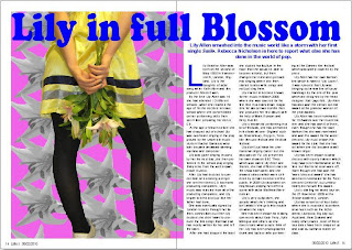
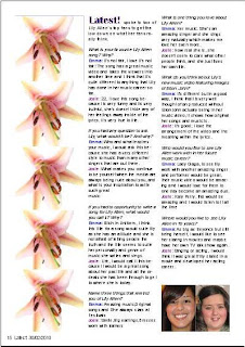
Annotated Double Page Spread
Comparison of my magazine to a main stream music magazine.

Sunday
Question two
Script
2) How does your media product represent your social groups?
My media product represents my social group well; I have used three main colours on the front cover of my music magazine so the audience would be drawn to it, the colours I chose to use in my magazine were also picked by people with my target audience age. When I conducted my questionnaire earlier on in the planning of my magazine, I found that there were three most popular colours; I used that information to construct my magazine further using the colours that were most favourite. I have included another bright colour on the content page to make it look more lively and so it would not make the rest of my magazine look boring and plain because that would not be very advertising to my social group that I have aimed it at. The reasons that I have taken this action on my magazine are because my target audience is ages between 8 and 14. I have aimed my media products at girls who like music and bright colours. My articles and pictures all related well with girls between the ages of 8 and 14, I have used a variety of pictures that resemble singers/bands that have the target audience of teenage girls. My articles were chosen through my questionnaire; I asked people in my target range what their favourite band and singer was, the answers that I received I then conducted my articles form the most popular bands and singers and used them as main articles on my front cover, I used other articles on my contents page that were voted for but not as much as my main headings on the front cover.
Saturday
Question three
3) What kind of media institution might distribute your media product and why?
I have included a screenshot of other organisations that have a similar target audience to my magazine and that could advertise my magazine.

Main organisation that could produce my magazine

IPC media produces over 85 iconic media brands, I would choose for IPC Media to produce my Music magazine as it has a range of products that are aimed at many different styles of people and different age groups. IPC Media is the production company behind NME; my magazine was partly designed around the layout of NME Magazine and I think that my magazine would be something very different to the normal designs of a magazine but would fit in well with the rest of the music magazines that are produced by IPC Media such as Q and top of the pops.
IPC Media only produces one music magazine which is NME, if IPC Media produced my music magazine then it would let them complete with other publishers that aren’t within the organisation of the IPC media as my magazine Latest is totally different to NME magazine.
I have included a screenshot of other organisations that have a similar target audience to my magazine and that could advertise my magazine.

Main organisation that could produce my magazine

IPC media produces over 85 iconic media brands, I would choose for IPC Media to produce my Music magazine as it has a range of products that are aimed at many different styles of people and different age groups. IPC Media is the production company behind NME; my magazine was partly designed around the layout of NME Magazine and I think that my magazine would be something very different to the normal designs of a magazine but would fit in well with the rest of the music magazines that are produced by IPC Media such as Q and top of the pops.
IPC Media only produces one music magazine which is NME, if IPC Media produced my music magazine then it would let them complete with other publishers that aren’t within the organisation of the IPC media as my magazine Latest is totally different to NME magazine.
Friday
Question four
Thursday
Question five
5) How did you attract/address your audience?
I have added a video of myself explaining how I attracted and addressed my audience.
I have added a video of myself explaining how I attracted and addressed my audience.
Question six
Question seven
7) Looking back at your preliminary task, what do you feel you have learnt in the progress from it, to the full product?
I have answered question seven by annotating my preliminary front cover task to my main front cover task, i have also annotated my preliminary contents page and main contents page.
Front cover

Contents Page

I have answered question seven by annotating my preliminary front cover task to my main front cover task, i have also annotated my preliminary contents page and main contents page.
Front cover

Contents Page

Tuesday
Step by step plan
Below I have shown how I added a picture to a very plain background and then created effect by dublicating one image and posting them back to back, I then added the writing far enough away from the face of my model so no clash happened.


Step through my production of my Double Page spread, I have shown on the two images below how I dublicated pictures and placed them all down the side of one page.
Friday
Pictures for Double Page Spread
Pictures used in the creation of my magazine


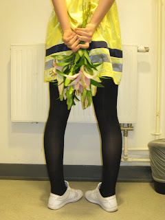
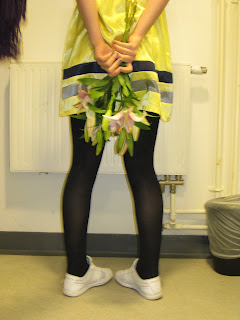
The image above is the image I used on my Double Page Spread, I created this image by editing two separate images onto a pink background, I faded the lily background slightly so that my image stood out to the audience. Th reason that I chose that particular image of a girl is because she conveys attitude just like Lily Allen does.
Pictures for Contents page
Subscribe to:
Comments (Atom)


